Theme colors
Typography colors
Header colors
Footer colors
-
Friday Night Grind and Great Tennis at Gold River
 Marty Anderson
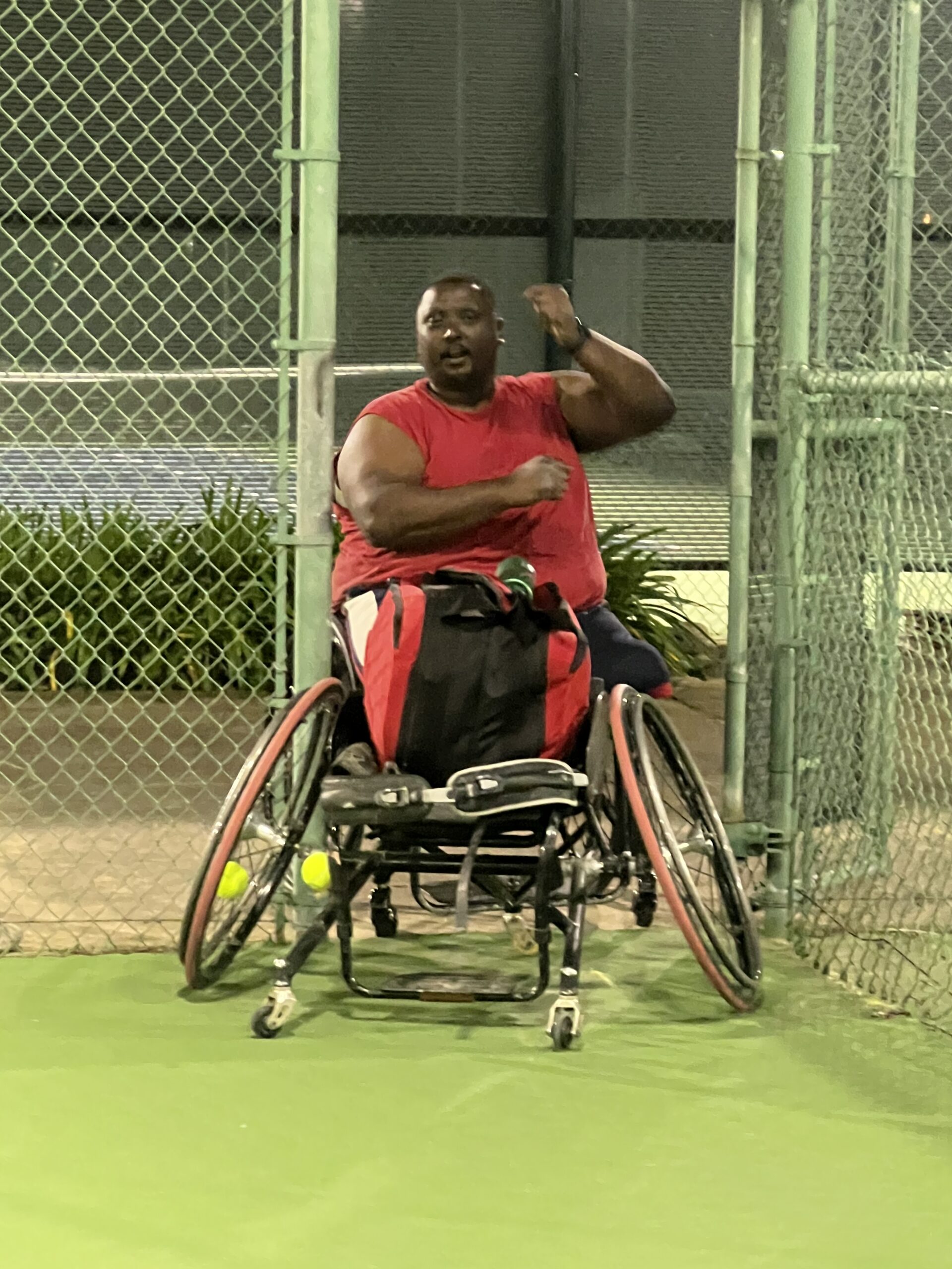
5 monthsTonight’s wheelchair tennis clinic at Gold River Sports Club was one of those sessions that reminds you why consistent work matters.
After a few solid weeks in a row of Friday night practices, it was just Marcus, Mark, Michael, and me (Coach Marty) on court. A small group, but a really productive one. The cobwebs are officially gone, the equipment feels dialed in, and everyone is starting to feel more solid in their games. That set the stage for some truly technical tennis.
We split into teams with Mark and me on one side, and Marcus and Michael on the other. As usual, we started with our standard warmups, beginning at the net and gradually moving back to groove our shots and build some rallies. Once everyone was settled in, the fun began.
We kicked things off with our go-to game of 21. For those unfamiliar, it’s essentially doubles without serving. Points start with a feed that can go to either player and anywhere in the doubles court. A point can only be scored on the third hit or later, including the feed. Once the third hit happens, the ball is live, and if a winner is hit or an error is made, a point is awarded. There’s no strict order for feeding, usually whoever is quickest gets the ball in, with a few gentleman’s agreements like letting the trailing team feed at game point. It’s a race to 21, win by two.
I love this game because of its flexibility. You can play it with different numbers, rotate players in and out, and adjust it to match the group. Tonight it was classic two on two.
The matchup was surprisingly even. Mark is our beginner, currently competing in the Men’s D division. I play Open Men, the top level. Marcus competes in Men’s C and B divisions, and Michael is technically unrated but would easily slot into Men’s B or A level tournament play. Different backgrounds, but balanced in all the right ways.
Michael and Marcus jumped out early, going up 4–0 before Mark and I could get on the board. We clawed back to tie it at 4–4, only to fall behind again 10–5. From there we battled back to 10-all, traded points up to around 16-all, and then Marcus and Michael shut the door, taking it 21–18 or so. A fantastic way to start the night.
From there we moved into a full doubles match, and the first set turned into an absolute grind. I knew it was going to be a long night when I went down love–40 in the opening game. I managed to fight back and hold, setting the tone that we were not going quietly.
Marcus and Michael did what good doubles teams do and began to focus their shots toward Mark, our newest and least experienced player. Mark is what we call a high-level injury in wheelchair tennis, meaning his spinal cord injury is higher up near the pecs. He straps into his chair for trunk support and is still developing his strokes, with consistency coming along little by little. Despite that, he fought like a champ and absorbed a heavy workload all night.
I stayed close to Mark, cheated when I could, stole a few balls, and probably called him off more than I should have, but that’s doubles survival sometimes. In the end, Marcus and Michael earned the win, taking us down 6–4, 6–1.
What I really want to share is how proud I was of everyone tonight. Both teams did what they needed to do to win their points. I took a bit of a walloping myself, which was humbling, but the quality of tennis made it worth it. Great effort, great intensity, and a lot of learning all around.
Marcus even broke out the virtual broom and made sure I knew I had been swept on the night, which I think might be a first in our Friday clinics.
Already looking forward to next week.

Comments
No comments yet.